

We've covered using CSS media queries to assign different stylesheets depending on browser window size. In that example, we changed the layout of the entire page based on the space available. It isn't required that we make such drastic changes with this technique though, so in this tutorial we'll go over a design tweak with a smaller scope. We'll also cover the syntax for using media queries within a single stylesheet and more examples of that.
The CSS media query syntax for calling an external stylesheet is like this:
<link rel='stylesheet' media='screen and (min-width: 701px) and (max-width: 900px)' href='css/medium.css' />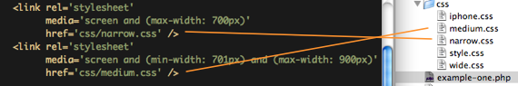
You may be familiar with the media attribute, normally being "screen" or "print" or even a comma separated list, like "screen, projection". The media attribute can be brought directly inside a CSS file, like this:
@media screen {
  body {
    width: 75%;
  }
}

@media print {
  body {
    width: 100%;
  }
}
Likewise, you can use more advanced CSS media queries like:
@media all and (max-width: 699px) and (min-width: 520px), (min-width: 1151px) {
  body {
    background: #ccc;
  }
}
You may use as many media queries as you would like in a CSS file. Note that you may use the and operator to require multiple queries to be true, but you have to use the comma (,) as the or operator to separate groups of multiple queries. The not keyword can be used to alter the logic as well.
#Example
Let's say we have a fluid width design where the sidebar is 35% of the width of the page. That means depending on the width of the browser window, that sidebar could be quite narrow or quite wide, that's just the nature of fluid width designs. With CSS media queries, we can say "if the browser is really narrow, do this, if it's wider, do this, if it's really wide, do this." Note that measuring width isn't the only thing media queries can do, it's just a particularly practical example.
In our example sidebar, we are going have a list of names of the Super Team which function as email links. The HTML is fairly simple:
<ul id="nav">
   <li><a data-email="chriscoyier@gmail.com" href="mailto:chriscoyier@gmail.com">Chris Coyier</a></li>
   <li><a data-email="elisabeth@moss.com" href="mailto:elisabeth@moss.com">Elisabeth Moss</a></li>
   <li><a data-email="amanda@righetti.com" href="mailto:amanda@righetti.com">Amanda Righetti</a></li>
</ul>
It's just a list of links. The
href attribute is a mailto: link. The only thing you might find unusual is the data-email attribute. In HTML5, you can use attributes prefixed with data- to store information, and it's perfectly valid. We are going to want to use that data later, but the href value isn't quite what we need having that mailto: link, hence the data attribute.
The default styling for the list will be this:
#sidebar ul li a {
  color: #900;
  text-decoration: none;
  padding: 3px 0;
  display: block;
}
When the browser gets a bit wider, in our example between 520 and 699px, we're going to use that extra space that opens up in the sidebar to apply an email icon to each list item.
@media all and (max-width: 699px) and (min-width: 520px) {
  #sidebar ul li a {
    padding-left: 21px;
    background: url(../images/email.png) left center no-repeat;
  }
}
As we get wider, from 700 to 1000px, we'll use the extra space again to preface the links with the text "Email: " (using CSS Content) instead of just the icon.
@media all and (max-width: 1000px) and (min-width: 700px) {
  #sidebar ul li a:before {
    content: "Email: ";
    font-style: italic;
    color: #666;
  }
}
Wider still, at browser window widths above 1001px, we'll literally append the email address to the links. This is where that HTML5 data attribute comes in.
@media all and (min-width: 1001px) {
  #sidebar ul li a:after {
    content: " (" attr(data-email) ")";
    font-size: 11px;
    font-style: italic;
    color: #666;
  }
}
At really wide widths, above 1151px, we will again add the icon as we used before. The cool part here is that we don't have to write an additional media query segment, we can just append an additional media query to our already existing one using a comma (behaves like OR operator) on the medium-width one we already wrote.
@media all and (max-width: 699px) and (min-width: 520px), (min-width: 1151px) {
  #sidebar ul li a {
    padding-left: 21px;
    background: url(../images/email.png) left center no-repeat;
  }
}
#All together now
#sidebar ul li a {
  color: #900;
  text-decoration: none;
  padding: 3px 0;
  display: block;
}

@media all and (min-width: 1001px) {
  #sidebar ul li a:after {
    content: " (" attr(data-email) ")";
    font-size: 11px;
    font-style: italic;
    color: #666;
  }
}

@media all and (max-width: 1000px) and (min-width: 700px) {
  #sidebar ul li a:before {
    content: "Email: ";
    font-style: italic;
    color: #666;
  }
}

@media all and (max-width: 699px) and (min-width: 520px), (min-width: 1151px) {
  #sidebar ul li a {
    padding-left: 21px;
    background: url(../images/email.png) left center no-repeat;
  }
}
Tidak ada komentar:
Posting Komentar